I love color. The brighter, the better. My fascination with color allows me to appreciate the abundance of vibrant hues in nature and create a fantasy world of my own.
My fantasy world includes color combinations that are bolder and more daring than we typically see in everyday life. I can tap into cognitive psychology and use color to elevate the emotional response to my photos and even control what people see and don’t see.
I use color to make my photographs stand out. It allows me to create mood and influence emotion. I can guide people to see what I want them to see by creatively using color as part of my composition. Color even increases the perceived value of my photographs.
I could fill a magazine with the hows and whys behind color theory and their application to photography. Here are four of my favorite fashion portraits that demonstrate my approach to color.
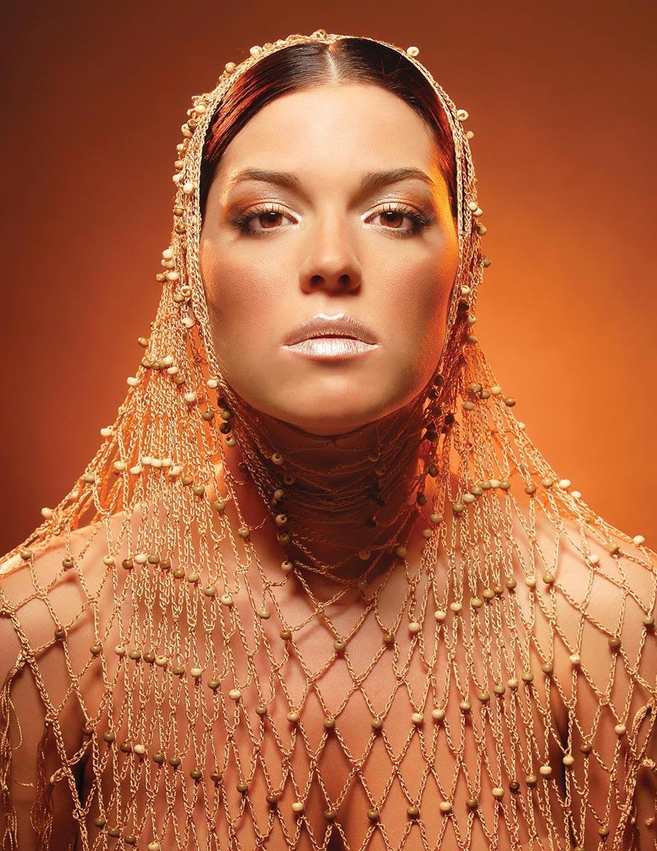
One of the easiest ways to use color for composition and attention is to bring the image into one color range and make the most important part of the image brighter to draw the viewer’s gaze (above). I had an interesting gold chain shawl I wanted to use as a fashion piece. I decided that orange was the best color to unite the skin tones, background, and chain. I’m a big fan of symmetry, so I chose to have the model’s hair parted in the middle and draped the neck opening of the shawl around her face. She’s wearing a simple tube top to provide bare shoulders and no distracting clothing details. The makeup is a beauty look that highlights the model’s features without introducing other colors.
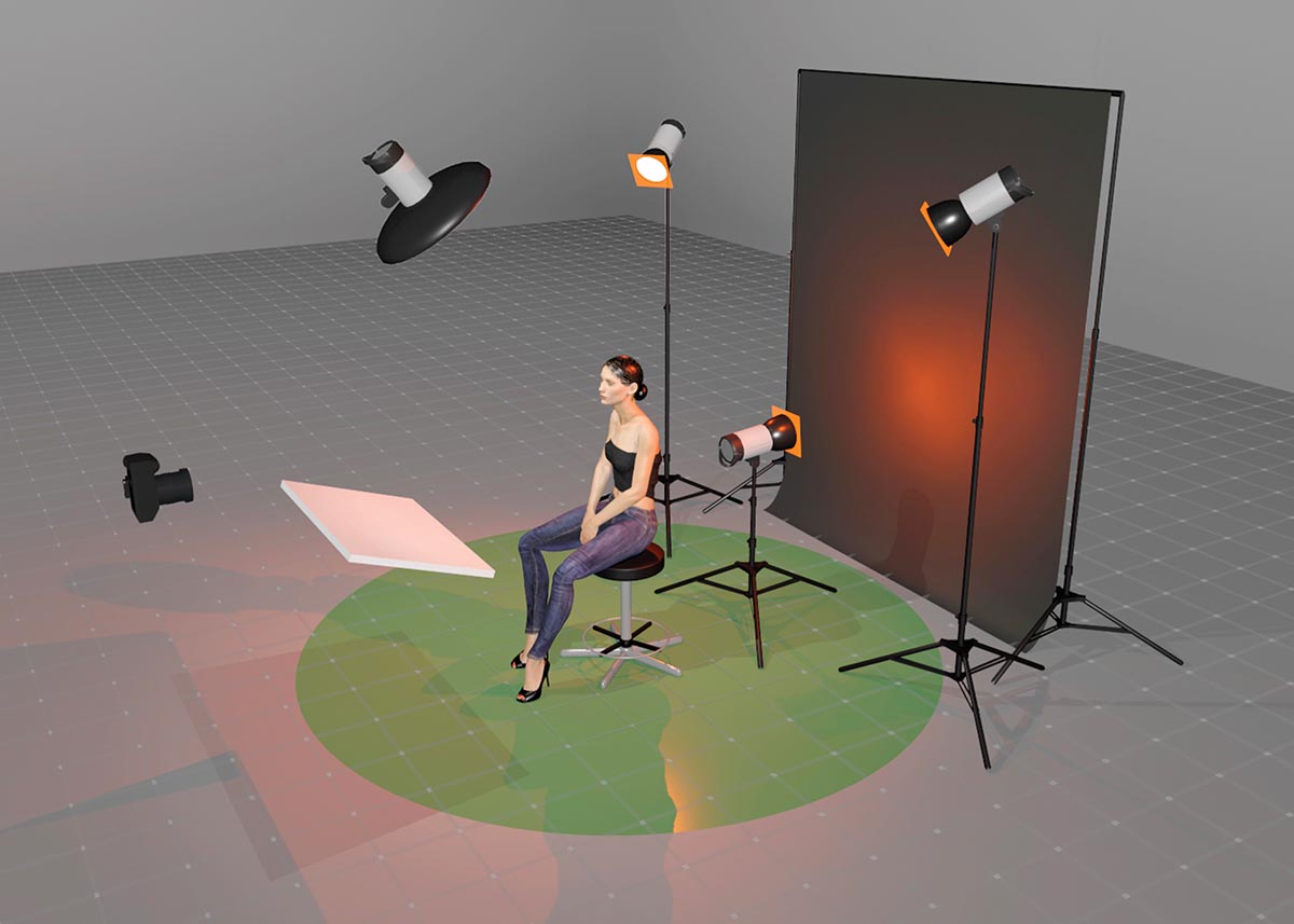
The lighting setup is one key light—a small 21-inch beauty dish with a 200ws flash placed slightly in front of the model and above her head. The shape of the beauty dish and its close proximity to the model create a rapid light falloff that automatically highlights the face—no Photoshop required. Behind the model are 200ws rim lights on each side, both with an orange gel. They’re aimed to ensure the orange light doesn’t hit the tip of her nose. Another 200ws strobe with an orange gel is behind her, aimed up at a Savage Universal #27 Thunder Gray seamless paper background. Since orange is often associated with emotional strength and determination, I chose a low camera angle and kept the model’s chin level to create a majestic look.
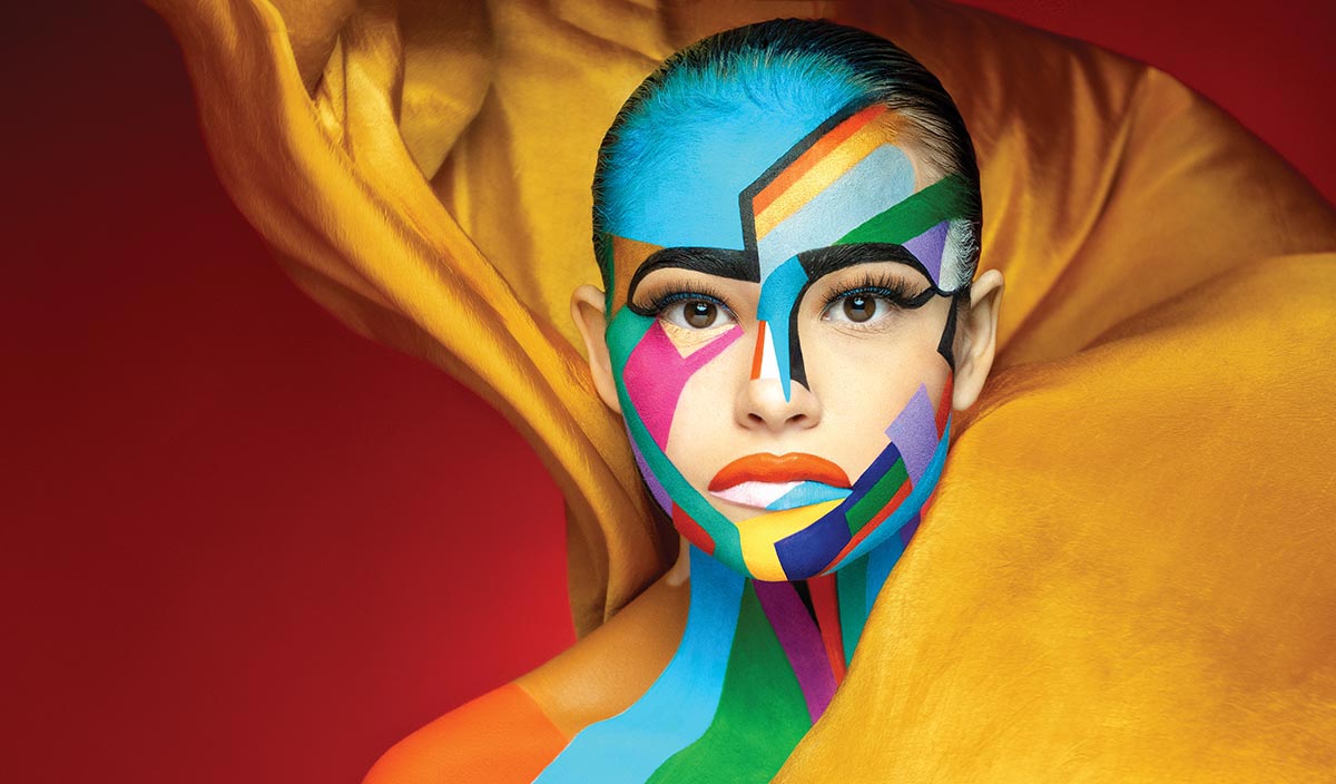
I was hired to produce images for a new hybrid LED light and given complete creative control to show off the digital burst capabilities of the light. The final images would be used in print, on the company’s website, on social media, and potentially in a video, so I needed to create a “scroll stopper.” I knew it would be essential to feature an attention-getting color set—not one that was already popular on social media. One of the best ways to stand out in a crowd? Do different. I chose red and gold as the base colors (above). Red draws attention like no other color. It’s full of passion and energy that motivates us to take action. Gold is a positive, strong color associated with wealth and success. It inspires us to reach for our potential. I felt confident that these colors embodied this groundbreaking piece of lighting equipment and on late 2021 social media would be compelling enough to get people’s attention. I wanted to create a calm-in-the-middle-of-chaos image that would allow me to show how the new light could stop action. I added more color to the subject herself as a type of mask because the image is about the capabilities of a light, not the subject. My makeup artist created a colorful mosaic on the model’s face, working primarily with cooler colors and including a small amount of red and gold to tie everything together. I placed a fan on the floor behind the model to blow the gold material around her head. The blowing material and mosaic makeup gave me enough chaos to hold the viewers’ attention. I kept the lighting simple. No gels were needed since I already had the colors in the shot.
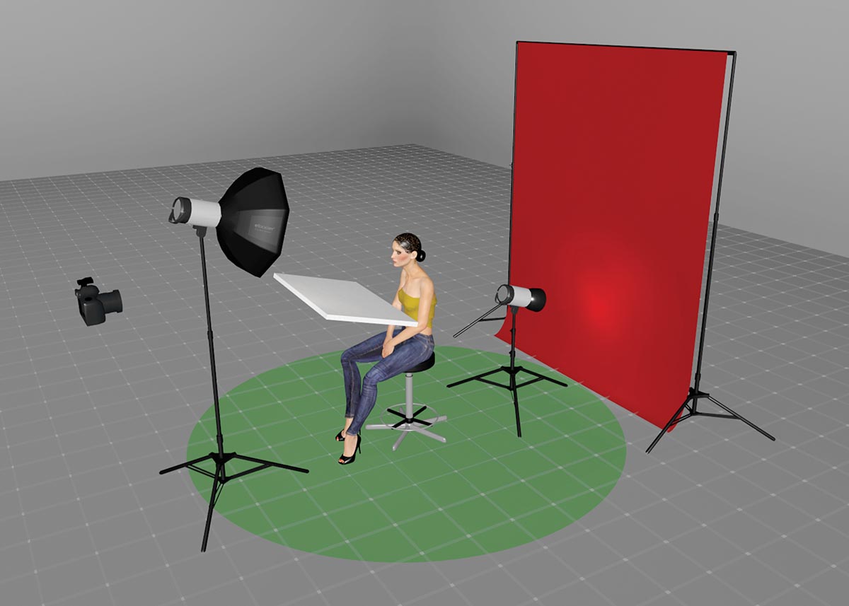
I lit this shot with a StellaPro Reflex S mounted in a 24-inch Octa Beauty Softbox from Chimera that was directly above the camera and aimed down into a 20x30-inch white foam board below the model’s face to add fill. I have a second StellaPro Reflex S on the floor behind the model aimed at the Savage Universal #08 Primary Red seamless paper background.
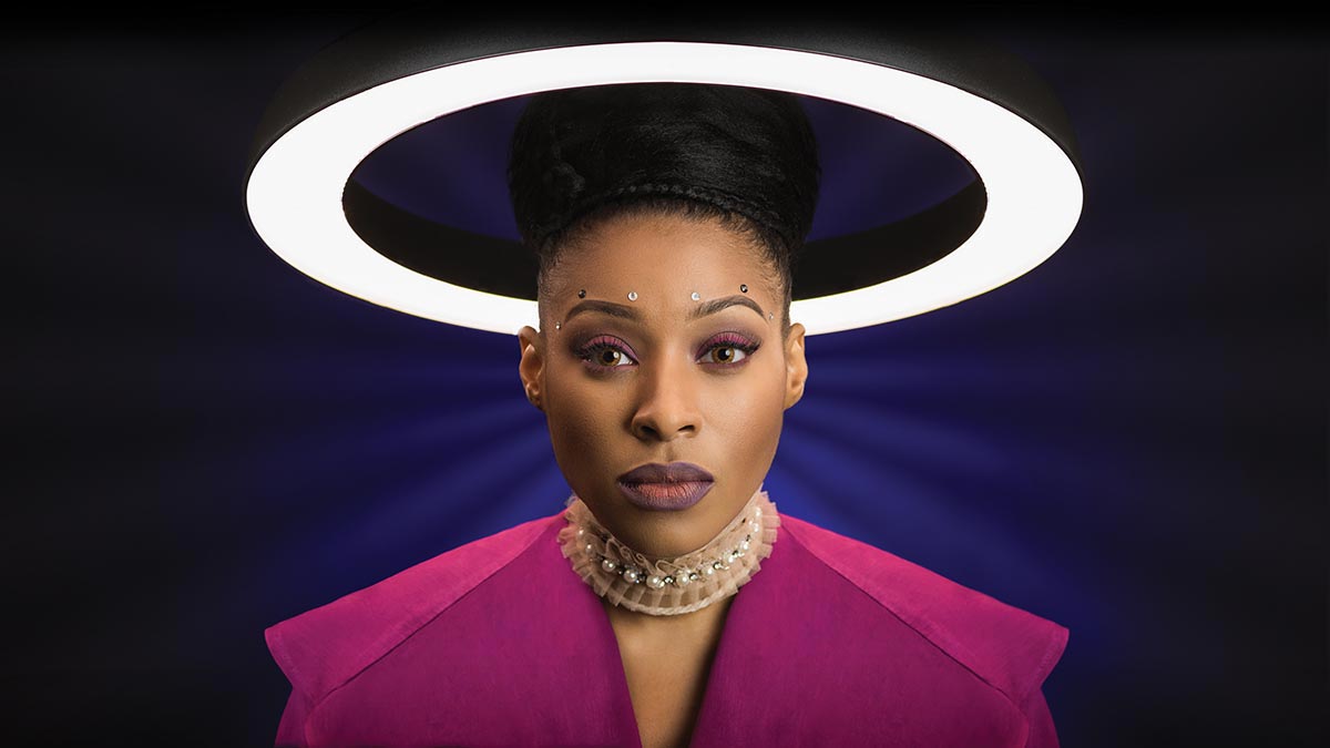
I envisioned this photo (above) with a sci-fi feel and a subject who could well be an AI instead of a human. The color scheme combines the calm, confident, and intelligent aspects of blue with the warmth and emotional balance of magenta. The color would have to set the mood since most of the robots we see in science fiction show little to no emotion. The simple makeup incorporates a bit of magenta. The lacy collar and jewels on the forehead add texture without adding color.
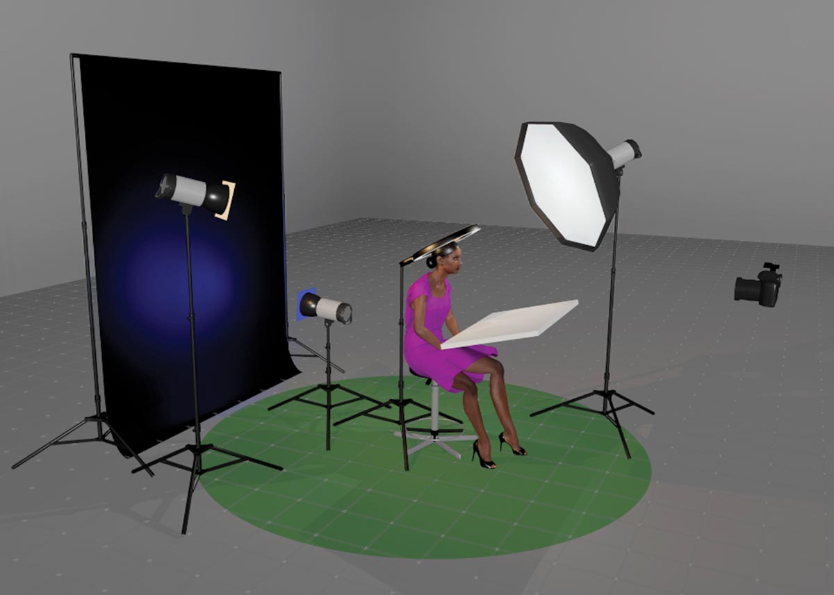
For this image I used three strobes and a ring light, which was placed above the model’s head. I had a 33-inch round soft box on camera right with a 200ws strobe as the key light. On camera left behind the model was a 200ws strobe with a slight amber gel as a rim light. A 200ws strobe with a blue gel was behind the model aimed at the background. The black streaks on the background were added in post-production.
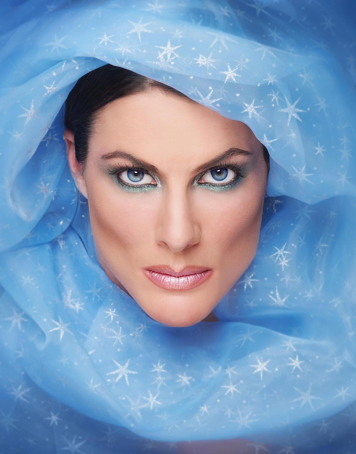
I often use the calm-in-the-middle-of-chaos concept for fashion portraits. In this case (above), the blue material flattered the models’ bright blue eyes and lent a kind of wizard or sorcerer impression when we wrapped it around her face. Keeping the makeup simple, we added a bit of color around her eyes and, for dramatic effect, a little contouring on her cheeks. Since sorcerers are routinely associated with dark, moody colors, I thought this lighter blue would work well to create a calm balance to my model’s serious and dramatic expression. I knew I could use shadow areas to create darker blues on the edges of the frame.
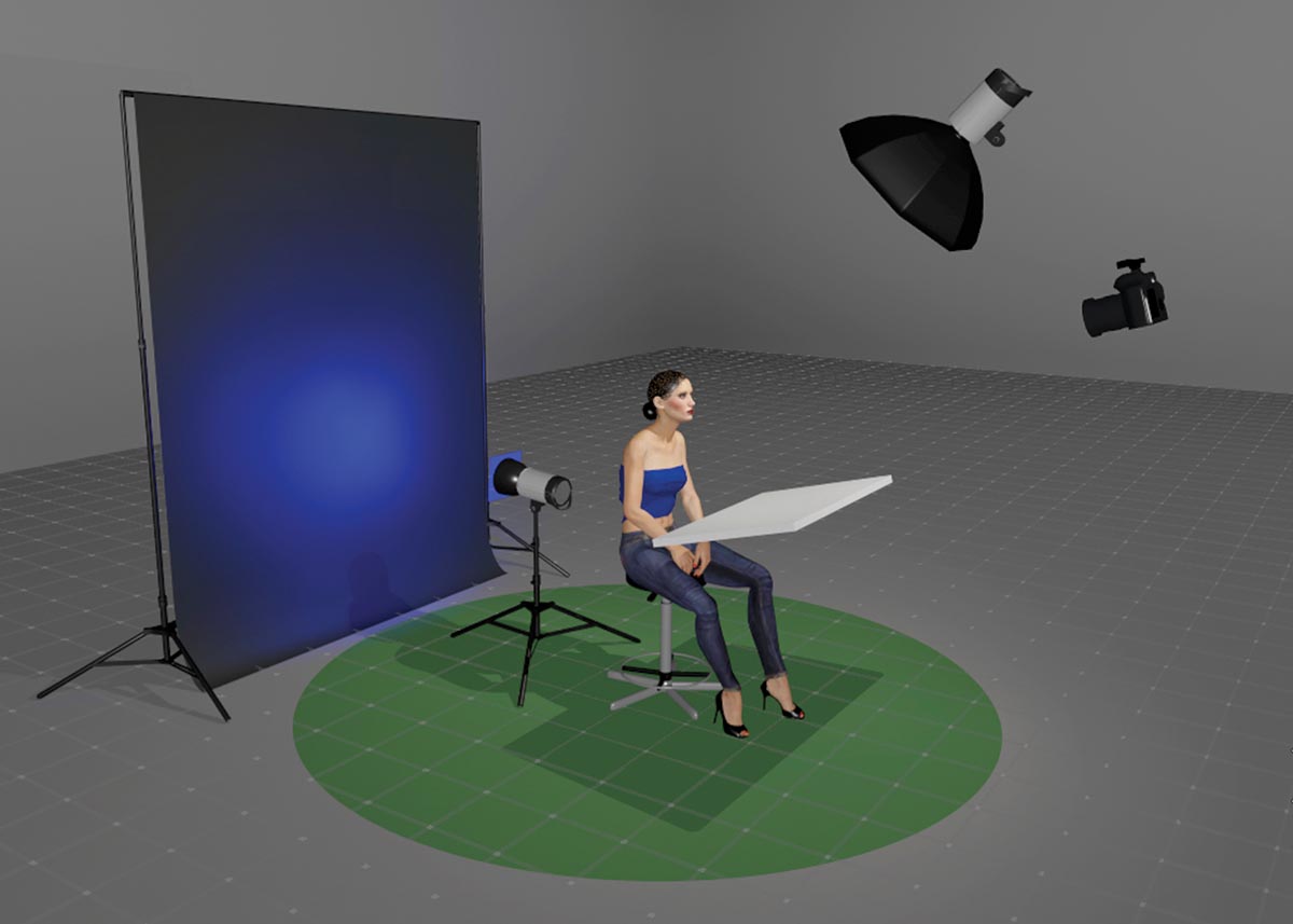
I lit this image with one 26-inch collapsible soft box placed directly above the camera and in front of the model. The camera was placed slightly above the model.
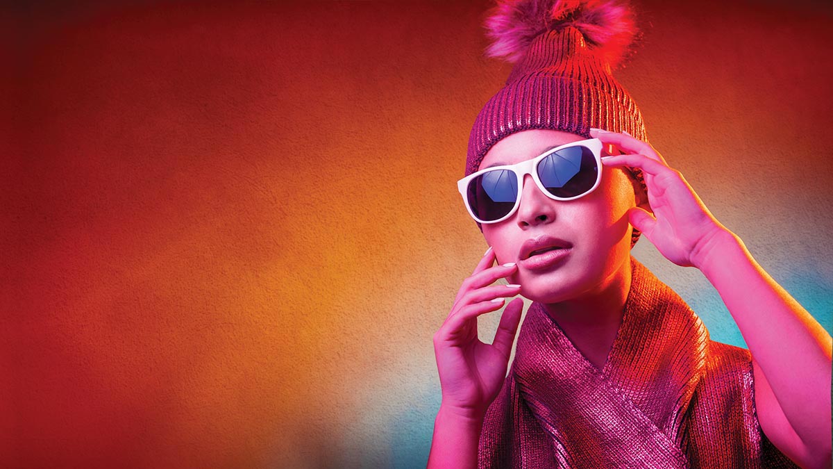
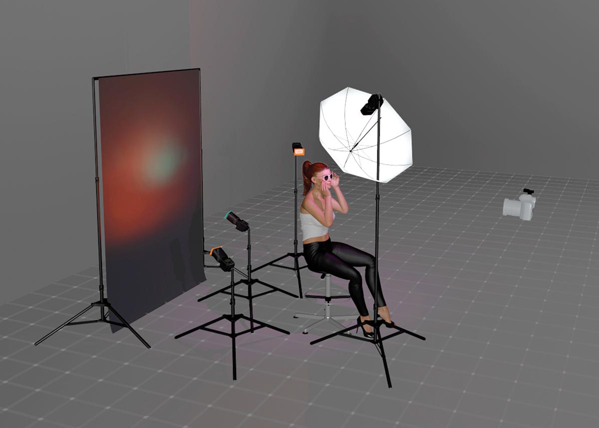
Sometimes you have to go for it. I created this (above) while teaching at a photography event, so I can’t say a lot of planning went into it. I used a dark red shimmery ski cap and matching scarf, a pair of cheap white sunglasses with blue-purple lenses, and a light gray background.
I had four 200ws strobes and a bunch of colored gels with me. As you can see in the sunglasses, my key light was modified by a 31-inch shoot-through umbrella. The lighting scheme includes a magenta gel on the key light. I have an orange gel placed on a rim light camera right, and I used two lights for the background. One strobe with a teal gel was placed low behind the model, and the other was camera left with an orange gel. The result is a color palette I generally wouldn’t have considered, but I enjoy the feeling of it.
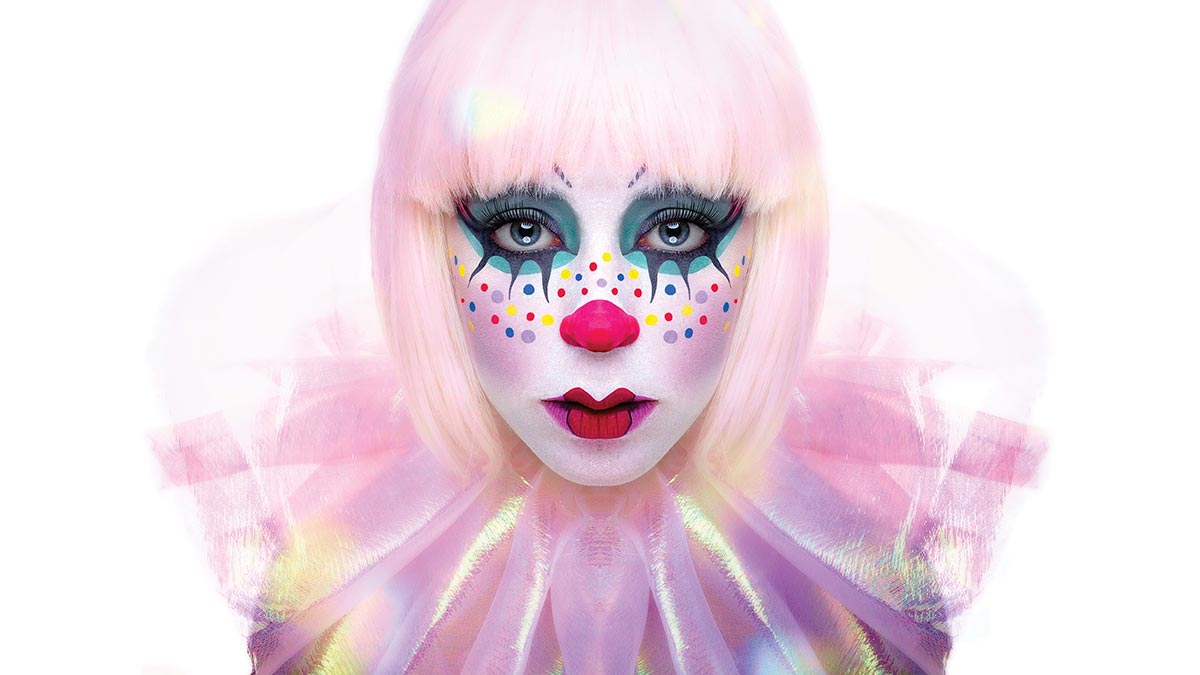
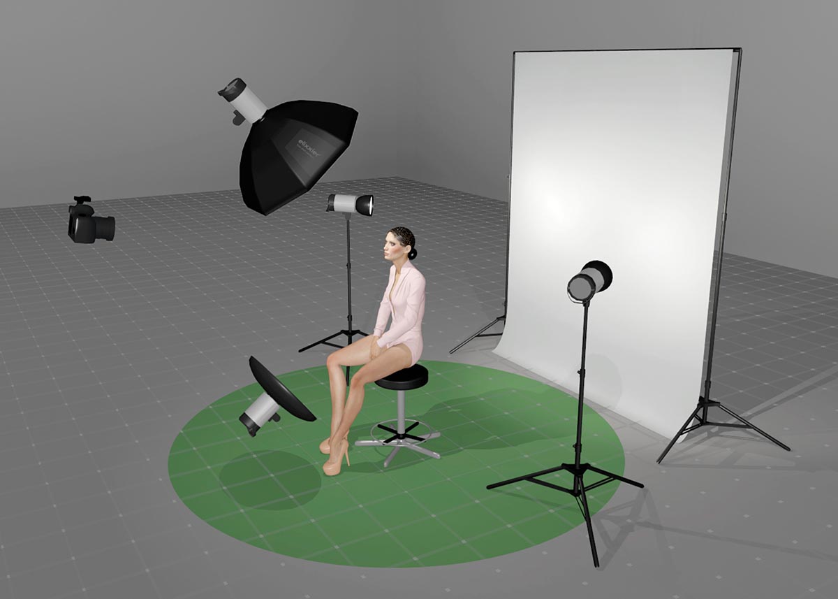
It’s important to point out that when done right, a lack of color can help highlight color. The woman in this image (avove) is a clown by profession, and she created her own makeup for this photo. I could have selected any of the colors she used and put her on a background matching that color, but that was an obvious choice. I opted for a high-key white background so she would be the image’s color and focus. I even added some blown-out colored bokeh to the image in post-production to give it a bit less polish and more fantasy.
The image was lit with four 200ws strobes. In front of the model was a strobe in a 33-inch round soft box above the camera; below the camera was a second strobe in a 21-inch beauty dish. Behind the model were two additional strobes, one on each side, aimed at the white background. I intentionally overexposed the white background by almost three stops to get a soft, dreamy feel to the edges.
Joe Edelman is a photographer, author, and photo educator.

